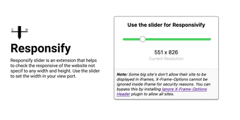
Efficient Tool for Website Responsiveness Testing
Responsify Viewer is a Firefox extension designed for web developers to assess the responsiveness of websites across various screen sizes. This tool allows users to manipulate the viewport dimensions dynamically using a slider, enabling a clear visualization of how a site adapts to different widths and heights. The extension is particularly useful for testing websites without being restricted to fixed dimensions, offering flexibility in design evaluation.
With its user-friendly interface, Responsify Viewer streamlines the process of responsive design testing. Developers can quickly adjust the viewport settings and observe changes in real time, making it easier to identify design issues and optimize user experience across devices. As a subscription-based tool, it provides essential features for web development professionals aiming to enhance the adaptability of their projects.
